Intro
This project was my final presentation for the User Experience Design course at General Assembly Boston. It is a website created to help users vote with confidence by providing trusted, organized information specifically for local elections. In this project, I conducted research, competitive reviews, and user testing and then analyzed the results to create a MVP.
Research Process
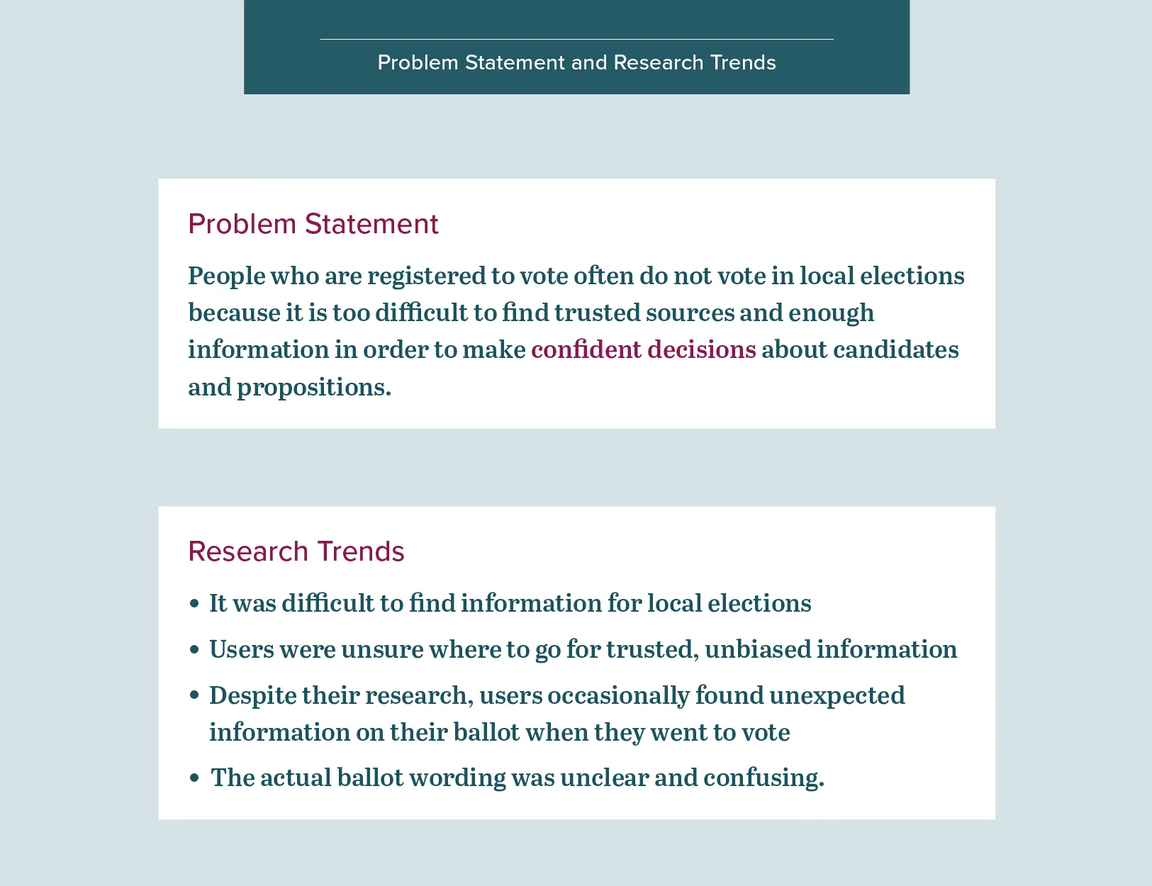
Voter Guide was inspired by the stories I heard from a few friends after the local elections in November 2017. They didn’t feel they had been able to make confident decisions about candidates and laws on the ballot; it was difficult to find clear information about what each candidate thought on specific issues so they could be easily compared. They also wasn’t sure if the articles they was reading were unbiased, since they were coming from many different sources. So even when they went to vote, most didn’t feel confident they made the best choice for them.
For my user research interviews, I targeted registered voters who had missed voting in an election. My goals were to find out how they conducted their research, how much time they spent doing research, and if they encountered any obstacles that kept them from voting.
Design Iteration
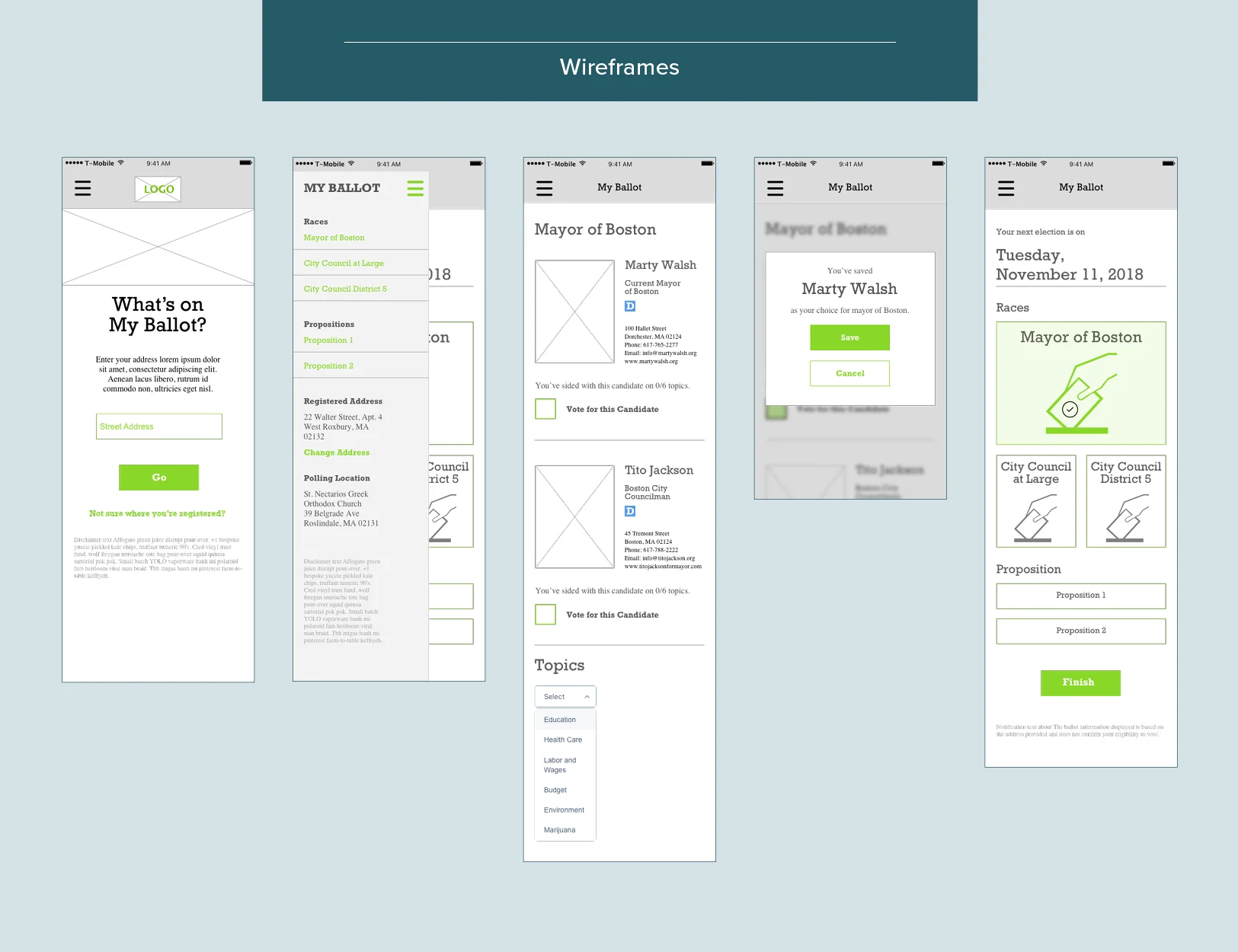
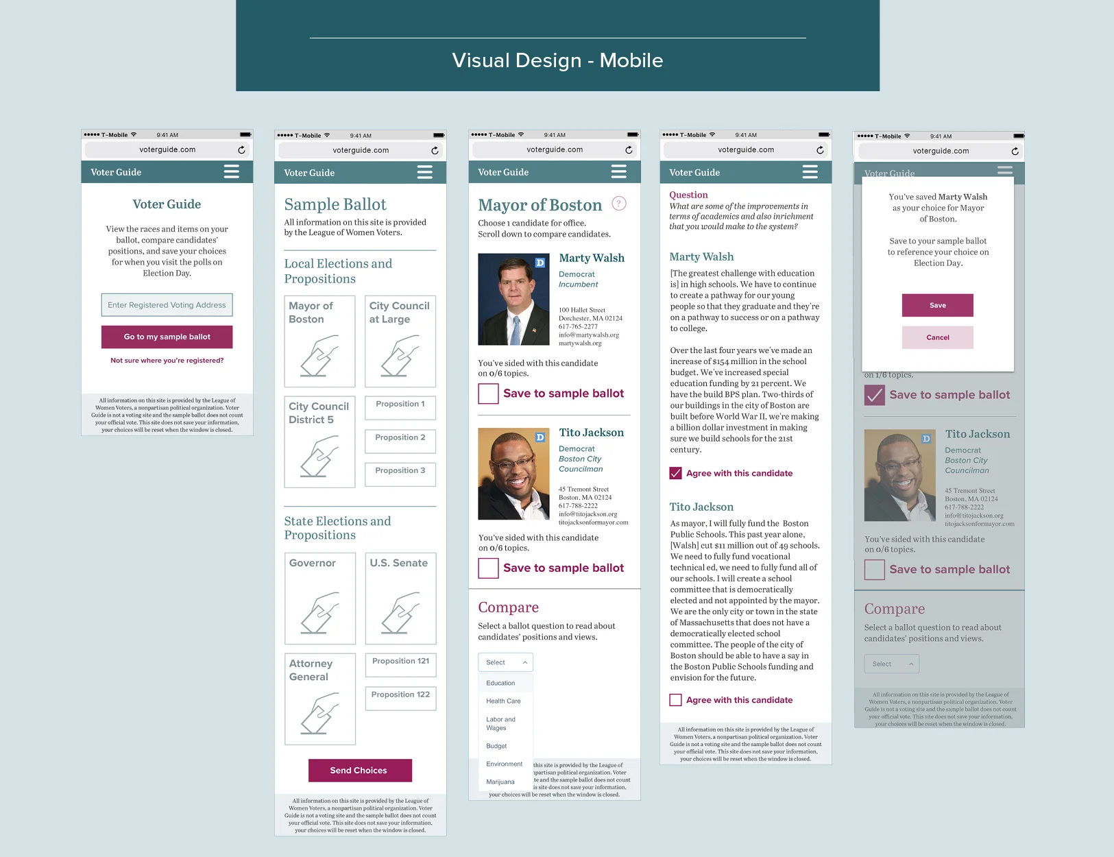
Initially, I designed this as a desktop site; I thought it would be easier for users to compare the information by making use of a larger screen. However, as I conducted more research, I realized many people would be using their mobile devices to read about candidates and make their choices for the election. Since one of the goals was for the user to be able to make their choices in an hour or less, it’s likely that someone could be using this site on their way to the polling location. After discovering that, I changed my design to a mobile first strategy.
After completion of the navigation and wireframes, I focused on a UI that featured clean, minimal design solutions with a sophisticated color pallet, and stayed away from using colors that could be associated with a political party. My design decisions and feature prioritization were derived from my research, including:
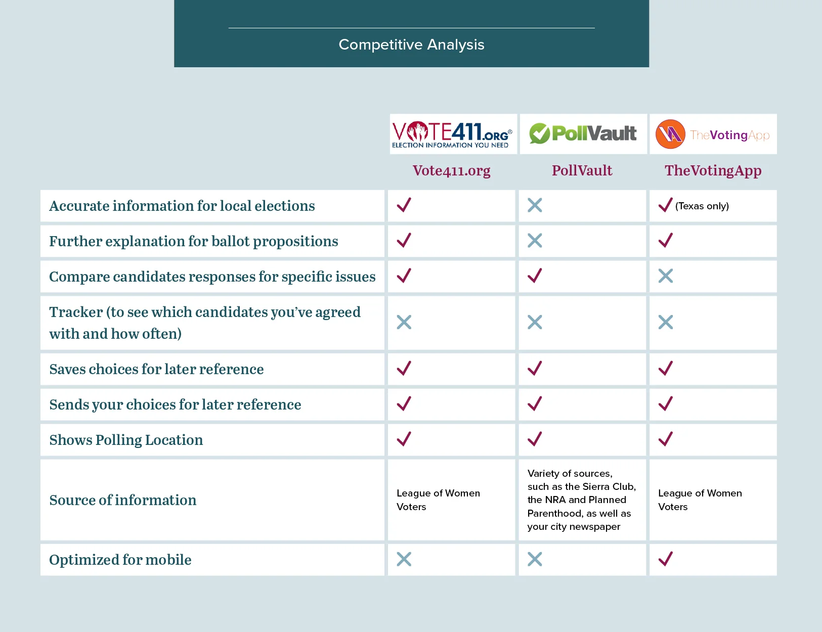
1. A nonpartisan political organization as the source of information on the site(League of Women Voters)
2. Detailed information on topics for local elections
3. Tracker for comparing candidate’s views with the user
4. Ballot proposition explanations
5. Saving users choices
Conclusion
Overall, this project was an excellent introduction into UX Design practices. After the course was completed, I conducted advanced user testing and received some valuable feedback, as well as new features to be considered for further explorations. I also received a lot of enthusiastic support for this project. It was gratifying to work towards a solution in order to help more people feel confident, informed, and involved in our government and country.
Client Cheng & Tsui
Role Product Designer
Intro
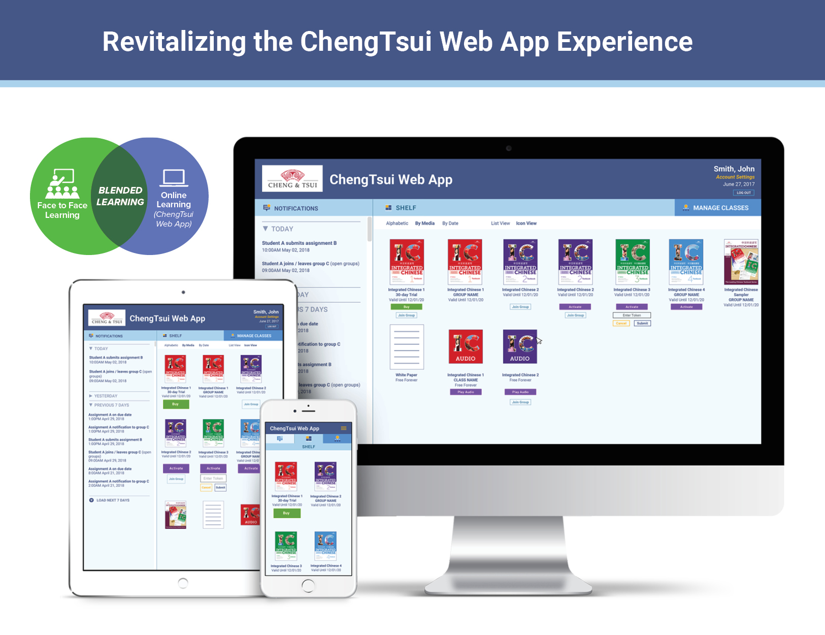
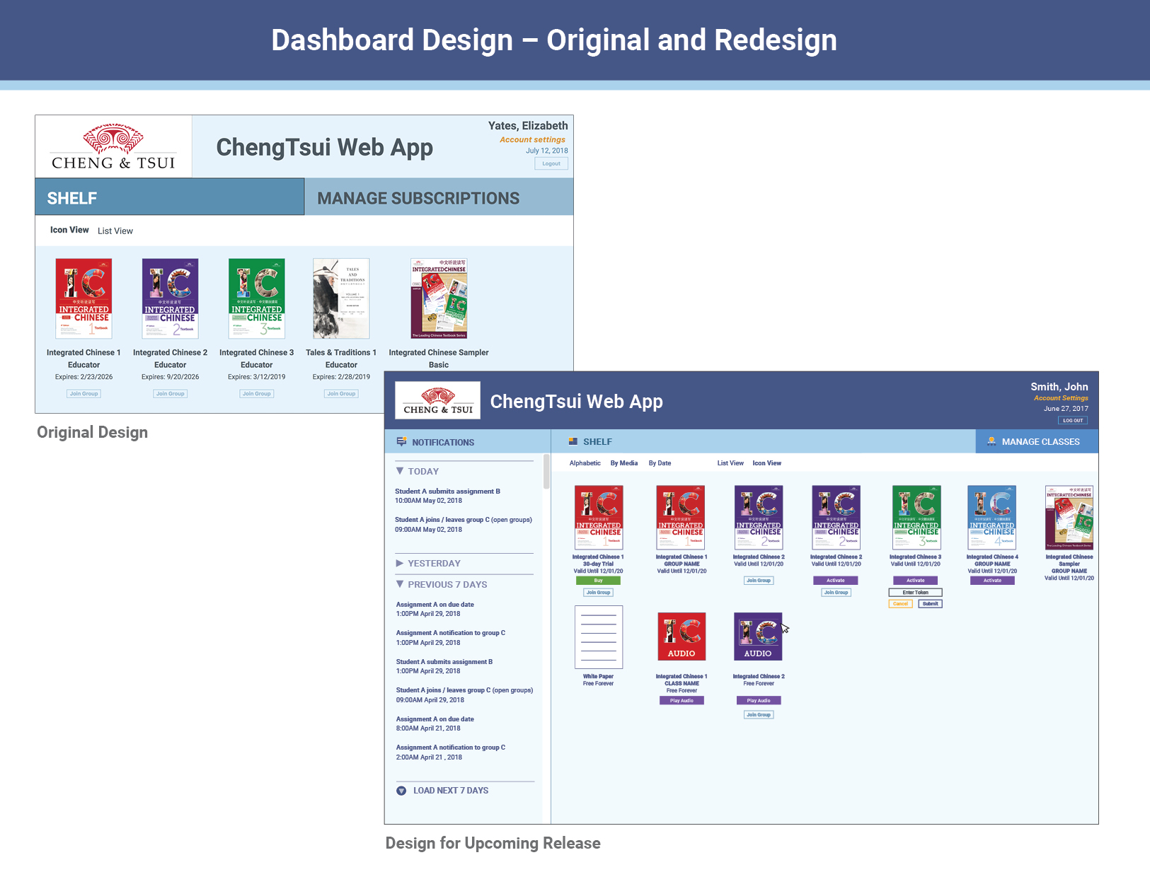
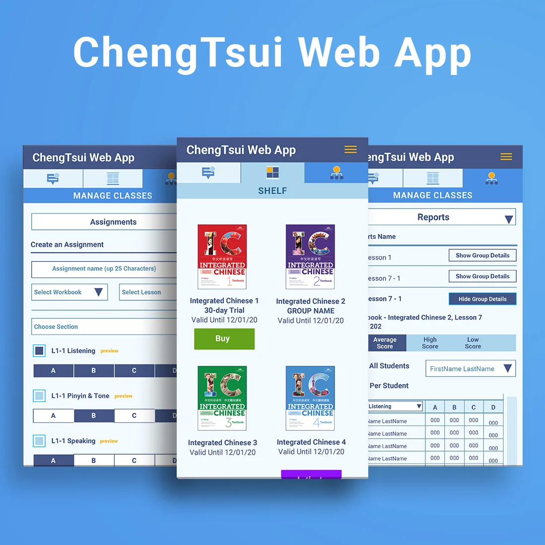
The ChengTsui Web App was launched in 2017 by the Boston-based educational publisher, Cheng & Tsui. It’s a blended learning product with an integrated learning management system (LMS). In 2018, I was brought on as a product designer to enhance the customers’ experience with the Web App. I worked with the project and creative director and developers in Texas and Russia to create and implement the features and updates for the upcoming release.
Problem
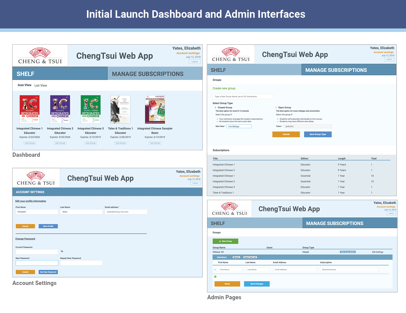
Many useful features of the Web App could not be included in the launch and needed to be designed and developed for the new release. In addition, the dashboard and admin pages needed a redesign to be optimized for mobile platforms. Lastly, the team needed a master style guide and UI library in an accessible format for reference.
In order to improve usability and have a successful release, we needed to modernize the Web App with the new features in a cohesive, well designed user interface.
Process
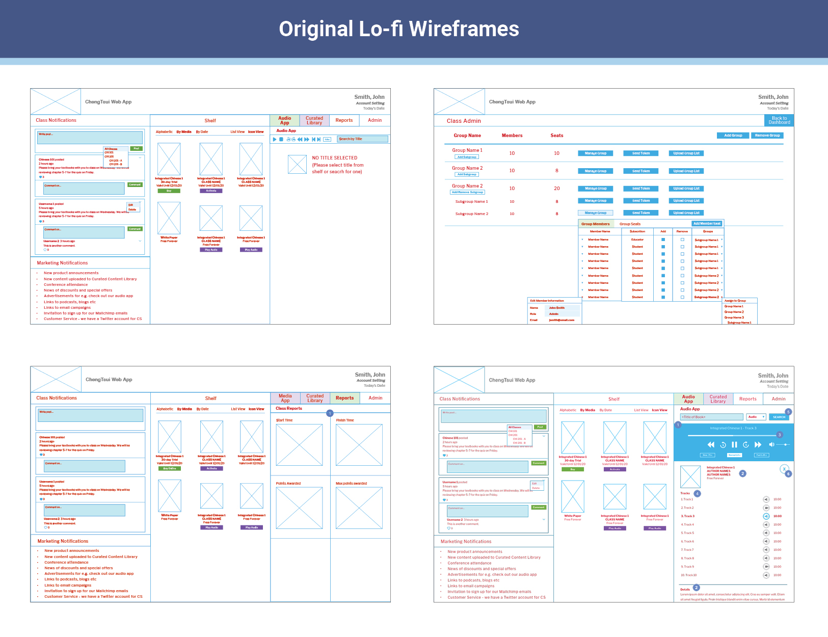
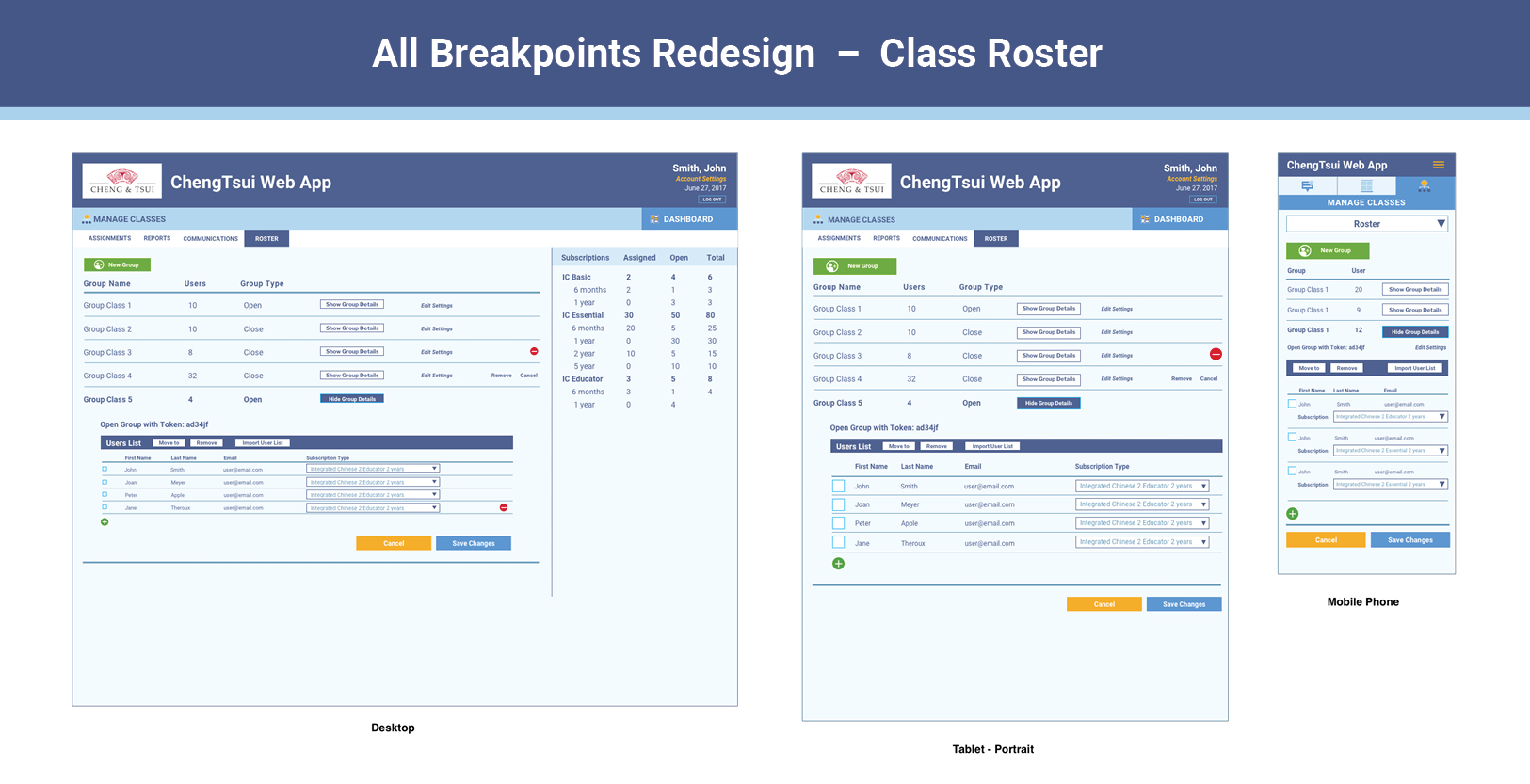
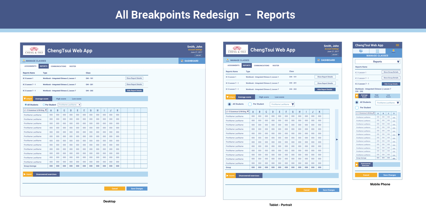
I began with the original lo-fi wireframes and addressed any composition changes needed to include the new features. The major additions were a notifications board, assignment creation with question previews, and auto-grading reports. After making layout changes and creating additional wireframes, I collected them into a sketch file and applied the updated design theme and new UI elements to the wireframes.
The next step was to modify the design for tablet and mobile phone breakpoints. I prioritized presenting the information in a simple and functional layout, a challenging task since the essential information on certain wireframes (assignments & roster details, grading reports) were dense and contained complex information.
All of the visual elements were collected in a master sketch file the team used as a style guide and UI library. Icons and other assets were shared on Google Drive.
Next Steps
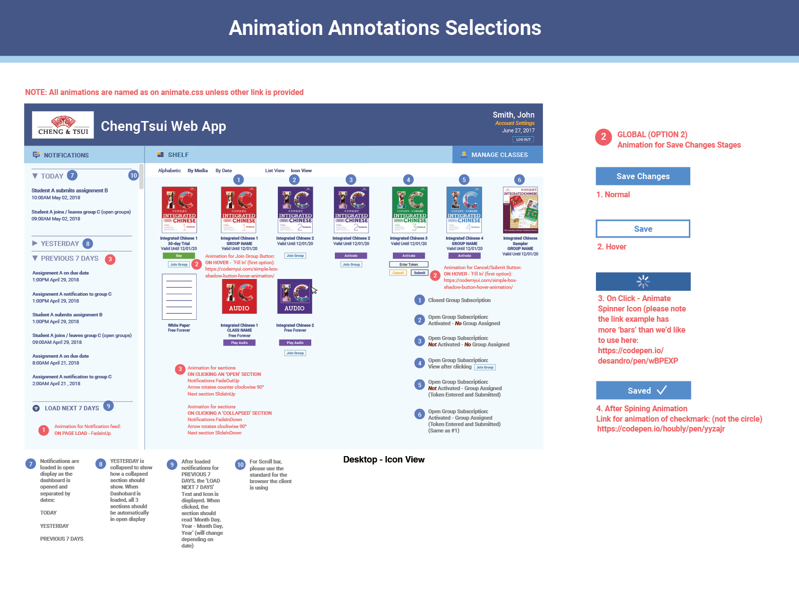
Now that the team had a master UI library and wireframes for each instance, the functionality for each interaction had to be established. The ‘Hover’ and ‘On Click’ behaviors were already included in the UI library, but a few more simple animations were needed to give the Web App a more polished look. After consulting with the creative director on the most appropriate animations, I added instructions to the master wireframes to explain the functionality of each interaction.
Conclusion
Because of the significant changes and updates for this release, the Web App almost felt like a new product. It was easier to navigate, and the design was clean and modern. Our agile work method put me in contact with the developers daily, and I became more familiar with the back-end mechanics and what they required from me to develop this complex product. Building out the wireframes and library showed me the depth of thinking involved in creating each part of this project – right down to the pixel.
Client Cheng & Tsui
Role Designer, Illustrator
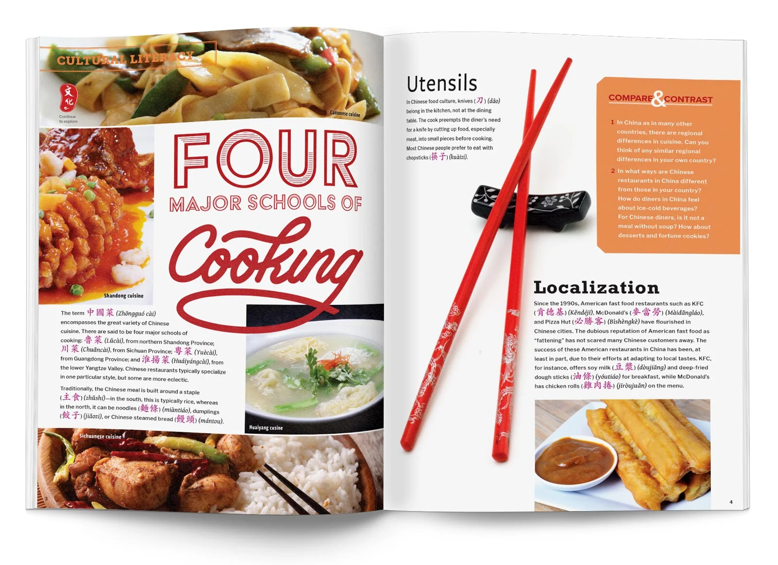
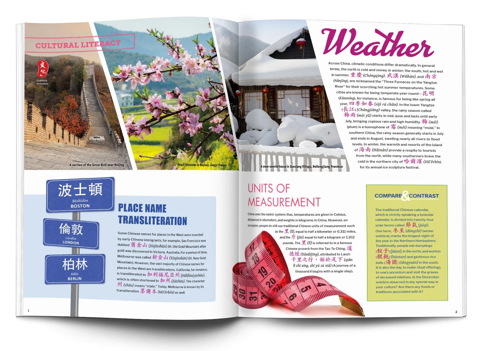
These two series of infographics and data charts were created for textbooks. The audience for both series were students learning Chinese language and culture, but the conditions for each were quite different and presented their own set of challenges.
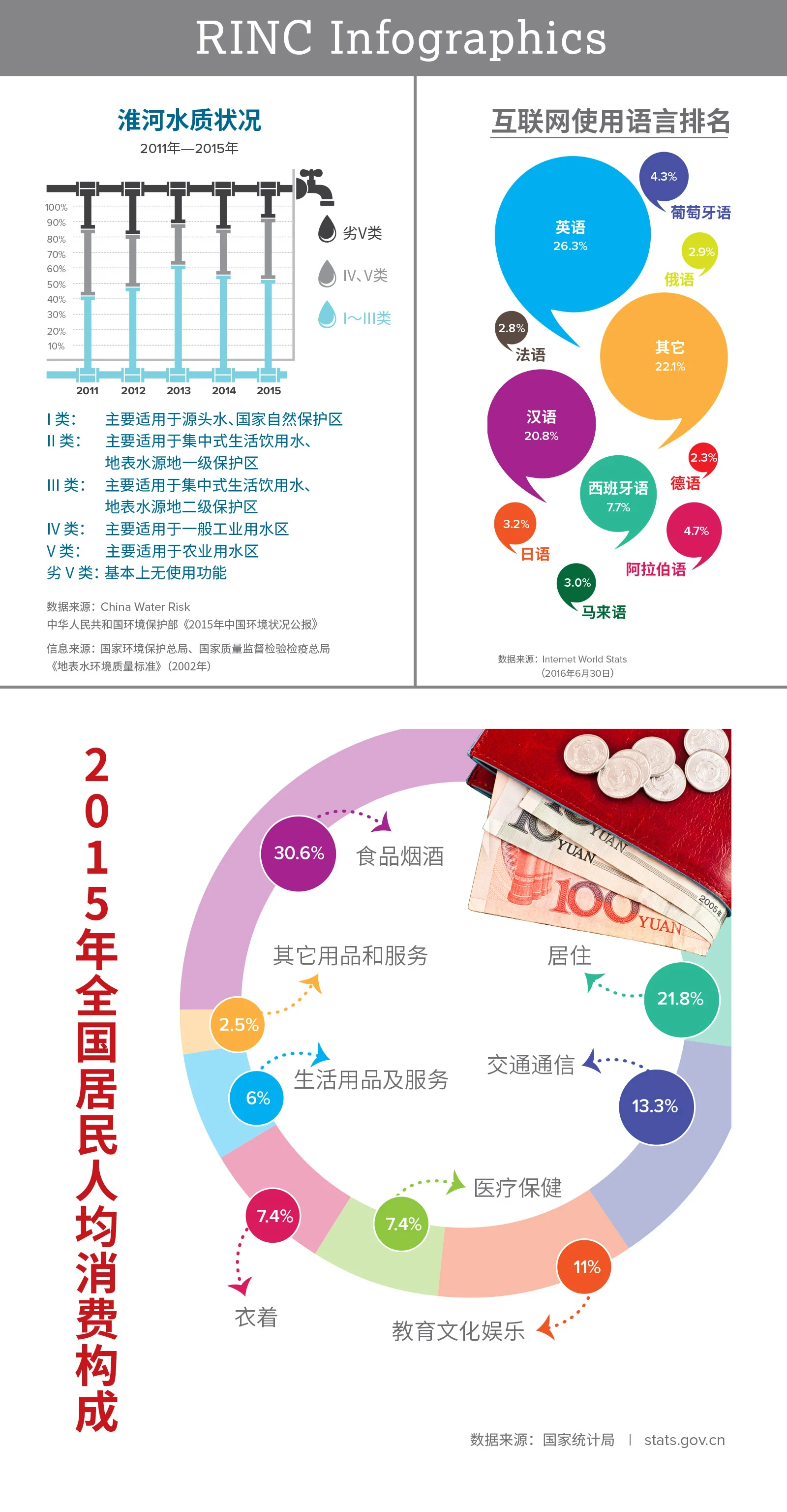
RINC Infographics
Audience: College students at a conversational Chinese level.
Goal: Reflect the tone and content of the essay using illustrations and graphics to show the data.
Design Process: The infographics accompanied a 2-3 page essay entirely in Chinese. In order to give the students a visual ‘break’ from the reading, the infographics relied heavily on using illustrations and bright colors. I focused on creating graphics that would represent the tone of the data accurately, so even someone without an understanding of the language could identify the context of the information.
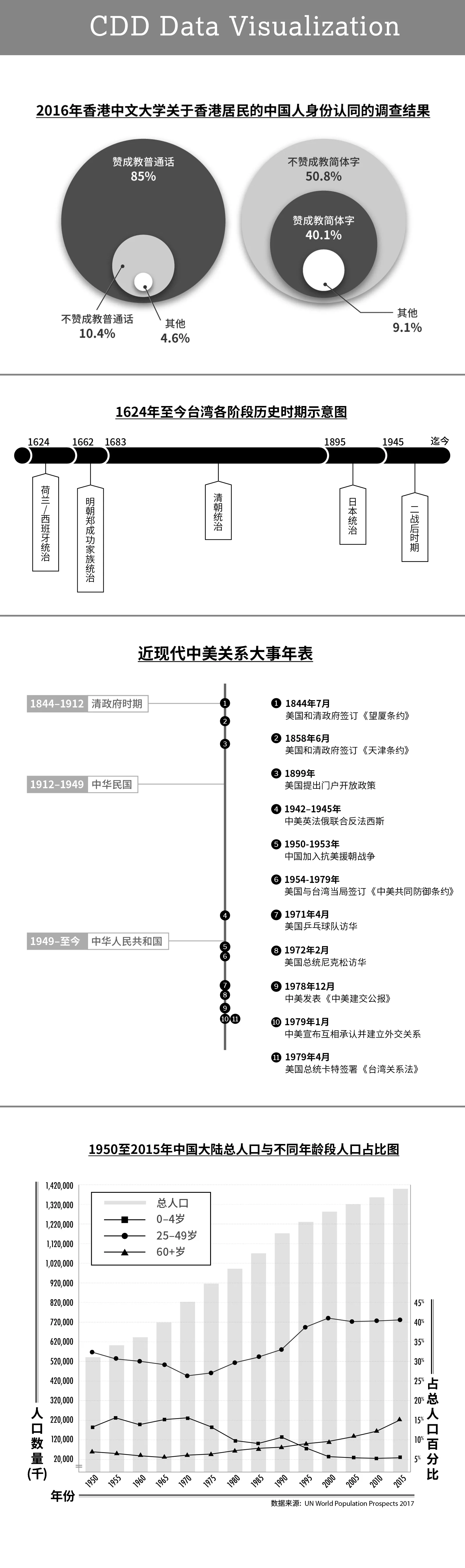
CDD Data Visualization
Audience: Advanced Chinese speakers learning about complex current events in China.
Goal: Create charts and graphs representing complex data to a mature audience.
Design Process: The infographics had some conditions: they had to be black and white; the data they contained was complex; and they had to match the tone of the content. I endeavored to make each graph look distinct and contemporary. Since I do not speak the language, these projects allowed me to sharpen my skills in information design.
Client Cheng & Tsui
Role UX Designer
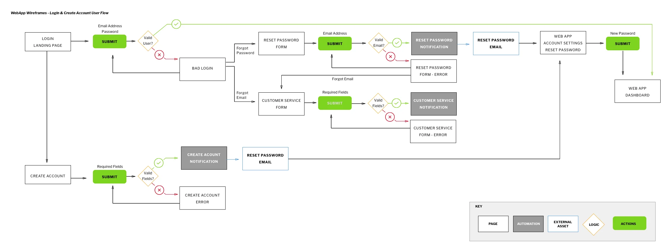
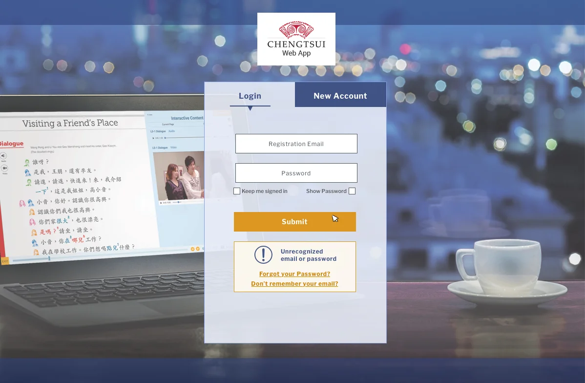
Intro
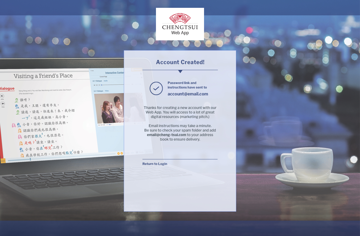
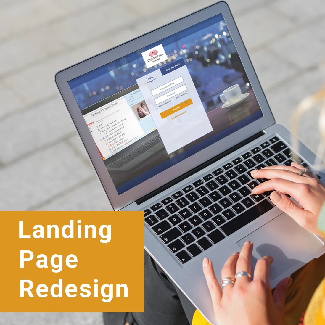
The login page for this web app required a better interface that addressed users needs.
Context
Previously, the only option a user had was to login. If the user had forgotten their username or password; or if they wanted to set up an account, they had to email or call customer service. This caused a time-consuming process for both the user and the client.
Process
The goals of this redesign were:
1. Allow the user to be notified if their username/password was incorrect and to optimize the process to help them retrieve it securely.
2. Minimize calls and emails to customer service for login issues.
Working with developers, customer service representatives, and UX designers, I created a userflow and UI interface to help address the obstacles with the current login page.
The result was a simple but effective sign in page that included the following features:
- Password reset
- Customer support request form
- Create account page
Client Cheng & Tsui
Role Designer, Art Director
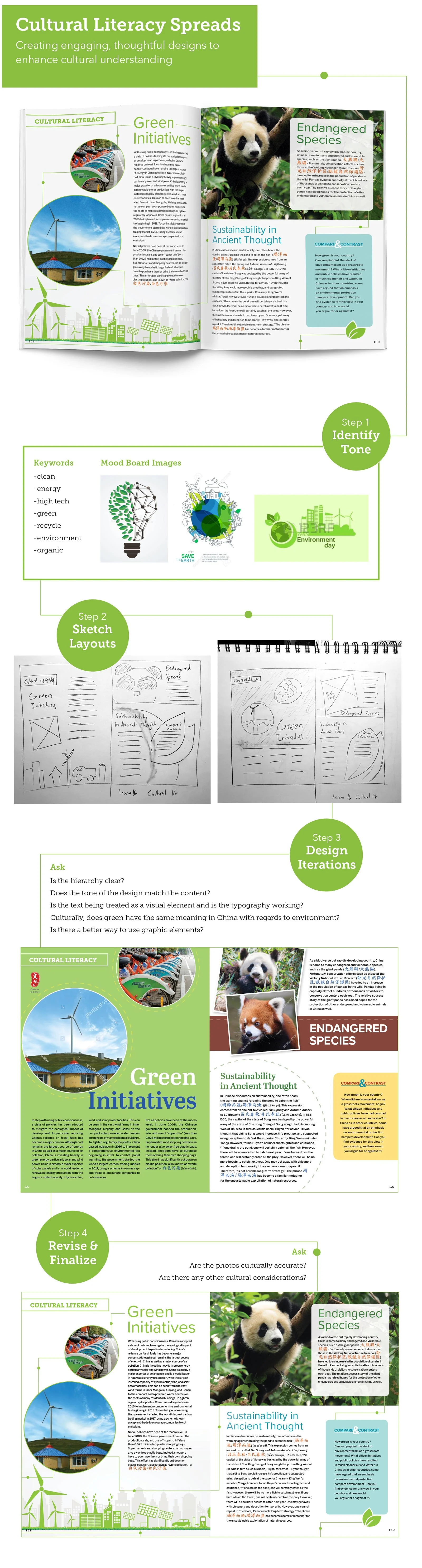
Design Process
The goal of these spreads were to show elements of Chinese culture in a visually engaging and thoughtful presentation. They use tone, composition, and graphic elements to engage higher education students learning Chinese. As the textbooks and language study lessons became increasingly complex throughout the series, so did the content for the cultural literacy pages. Some topics covered in the advanced lessons were clean energy, finances, and gender roles in Chinese society.
Client Cheng & Tsui
Role Designer, Art Director
Design Process
As a member of a small design team at Cheng & Tsui, I had the opportunity to work on a wide variety of marketing projects. Partnering with marketing and sales teams, I designed banner images, newsletters, email and social media campaigns that promoted our company's products, branding, and online presence. In my role as assistant art director, I advised on campaign strategy and goals.
Client Cheng & Tsui
Role Designer
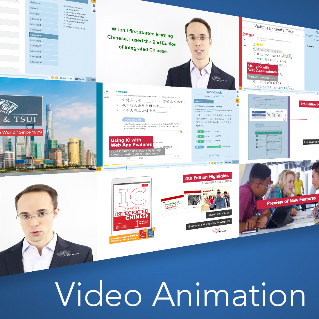
Design Process
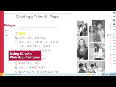
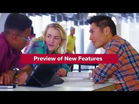
In 2017, Cheng & Tsui launched the ChengTsui Web App(TM), which accompanied the new 4th edition of their bestselling and award winning Chinese textbook series, Integrated Chinese. Before the web app was released, the web app was exhibited at national conferences and online promotions. In order to show the functionality, I used screenshots and Sketch files to create the animation of the web app features in these videos, which would ultimately reflect the final result of the fully functioning web app.
Client Houghton Mifflin Harcourt
Role Illustrator
Design Process
In 2011, HMH created a new branding structure to better reflect their mission of fostering passionate, curious learners. The new tagline was ‘Inspire Curiosity.’ I was asked to create illustrations that would become part of a series to enhance the new brand identity of the company. These inkblots were the final result.